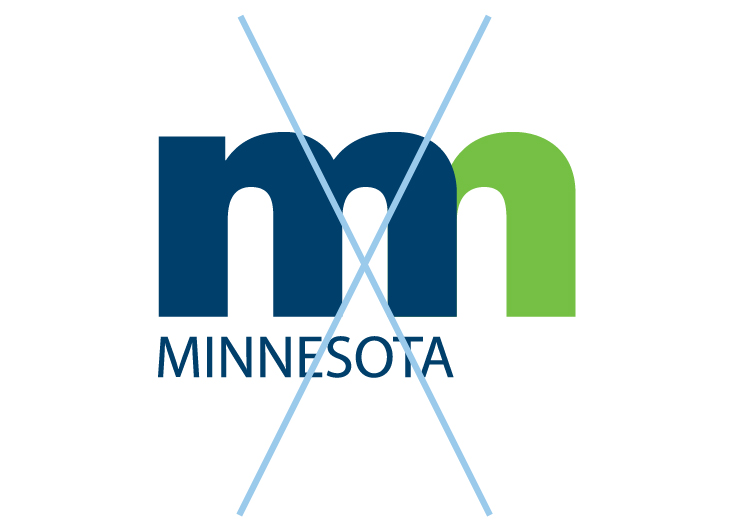
Minnesota State Logos
The Minnesota logo is approachable with a reliable and authoritative character that Minnesotans can trust. The colors pay homage to the woods and waters that drew the first Minnesotans to the Land of 10,000 Lakes from near and far. Together our logo and brand give us a recognizable, memorable way to communicate and share our values, our resources, our stories and everything we love about our state as a place to visit, do business and call home.
This page walks through the look of the state logo. Do not alter or change the Minnesota logo. Use the Minnesota logo instead of an agency logo when possible.
Primary Logo Lockups
Below are the three lockups of the State of Minnesota logo and the logo icon.
Primary
Justified
Horizontal

Icon
Additional Logo Lockups
As shown below, each lockup can be printed in color, grayscale, black, or reversed.
Color
Color Reversed
Grayscale
Grayscale Reversed
Black
Black Reversed
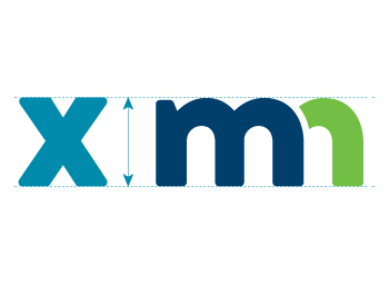
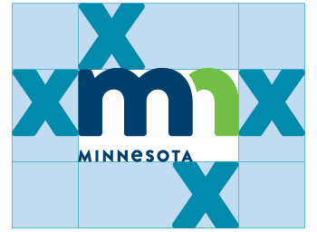
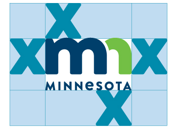
Minimum Clear Space Requirements
Proper use of clear space ensures visual impact and legibility of the logo. When calculating the minimum amount of clear space please follow the guidelines provided below. Additional clear space is preferred whenever possible.

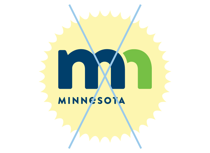
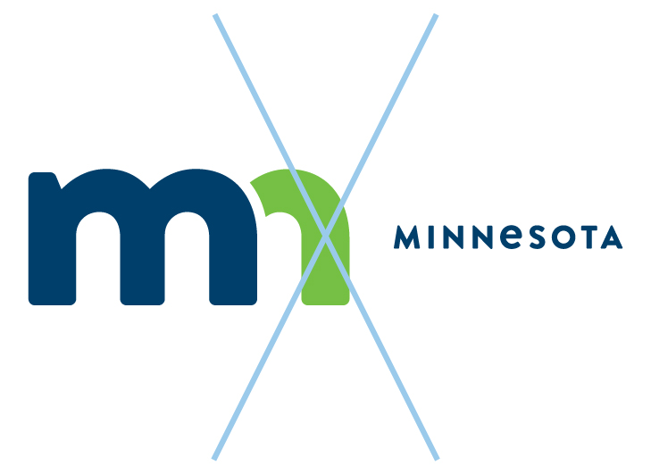
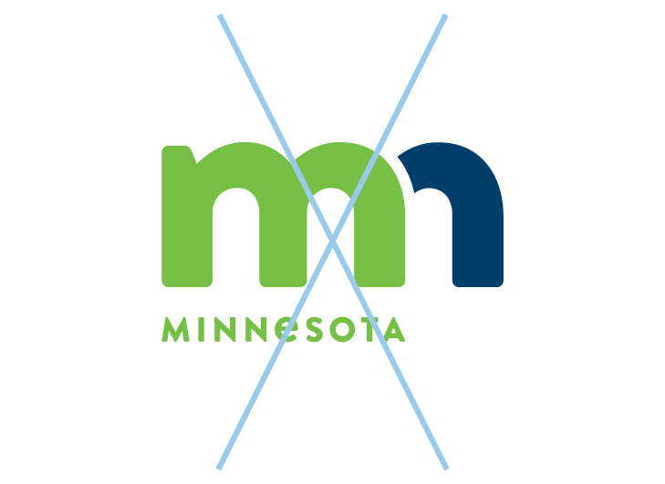
Incorrect Logo Usage
Never modify, recreate, or reposition any elements of the State of Minnesota brand logo. Changing the logo in any manner will dilute its impact and detract from its ability to build and support the brand.
Added Elements
Moved Elements
Changed Colors
Distorted Logo
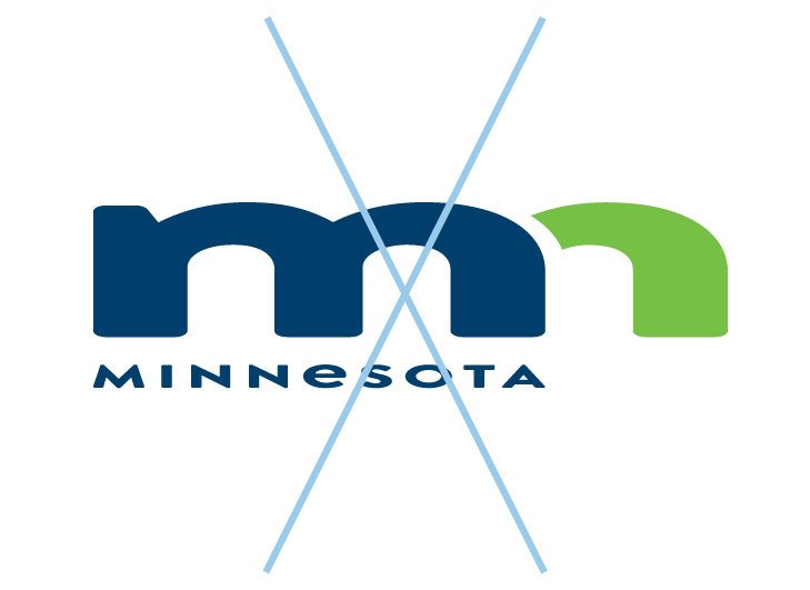
Recreated Logo
